The Power of Colour
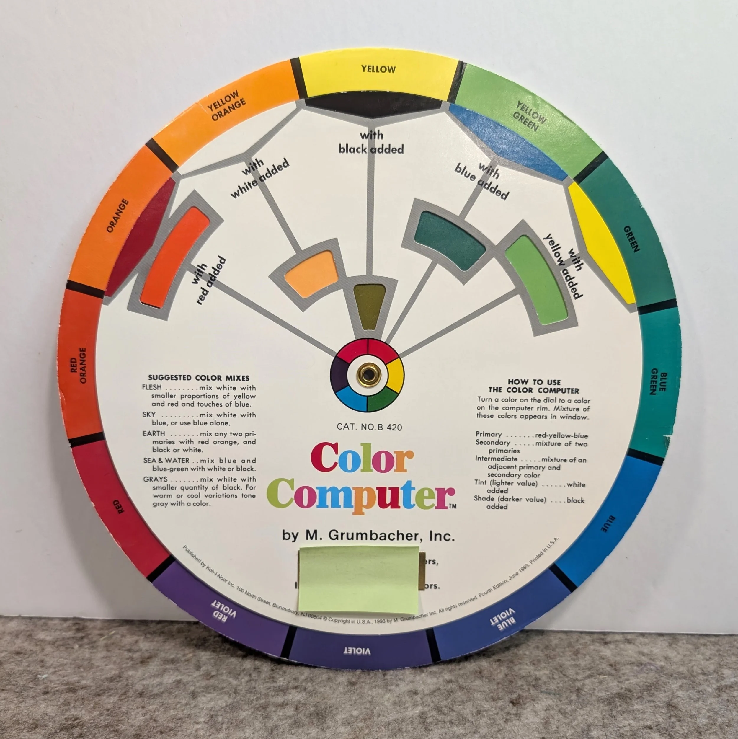
the colour wheel from my college days!
If you’ve become a regular follower (or actually know me from guild or teaching classes) you’ve probably noticed by now my love of freakishly bright colours. They just make me happy. That’s the thing about colour…it’s incredibly personal and evokes different responses, memories and feelings for everyone.
The psychology of colour is an actual study of how colours can influence human behaviour and emotions. I remember, while in college in the early 1980’s, that I took a colour theory class and one of the lessons was about colour psychology and how it affects people. One of the examples given that I found fascinating was about the fast food industry. For those of us of a certain age you will remember that all of the McDonald’s staff uniforms back then were in brown, red and orange. Apparently those colours were more “appetizing” in the food industry and people usually purchased more items when these colours were present. Blue was one colour that was not popular for the food industry because it was thought to suppress appetite. They’re not going to sell many burgers if people don’t feel hungry!
Back then home designers recommended that people paint their dining rooms dark red because it was thought to encourage healthy appetites and lingering while dining. And these same home designers were also recommending that new parents were not to paint their baby’s room yellow because it made babies cry more. Not really sure if that’s true, but it was a trend at one time.
We’ve all heard about certain meanings of different colours…Red is associated with passion and love. Blue is associated with trust and tranquility. Green is associated with nature and wealth. Yellow is associated with joy and caution. Purple is associated with royalty and mystery. Not only that, but holidays have colour associations too…red and green for Christmas, purple and yellow for Easter, black and orange for Hallowe’en, green for St. Patrick’s Day, and pink and red for Valentines Day.
When it comes to quilting, once again, our emotions and personal taste come into play in a big way. I always have a really hard time making anything for my sister who prefers browns, rusts, beiges and other earthy tones…it’s a snore fest for me and I have a really hard time being excited about working with this colour palette. And, there are those of you who love these earthy tones, and the bright, crazy colours that I enjoy working with give YOU the heebie—jeebies! Trust me, my feelings won’t be hurt. LOL. Like I said before, it’s very personal.
When I worked at the Ultimate Sewing Centre I had many people come in on a day that I was working so I could help them choose fabrics for their projects because they always liked what I picked for them. It was a wonderful compliment. For me, choosing colour for quilts is very intuitive…I don’t really even have to think about it, but I also know that not everyone feels confident in their choices. A little bit of knowledge of colour theory can really help you if you feel that way too.
While working at USC I also ran a class on Colour Theory that was very popular. It was always held in the evening while the store was closed so the students could use actual bolts of fabric to create the different colour harmonies and were able to get some hands-on practical experience choosing fabrics and colours with my guidance. The great thing about these exercises was that people were forced to choose colours outside of their comfort zone and many of them liked the combinations so much that they purchased the fabrics. The only bad thing was that the store was a mess afterwards and I spent the next day tidying up!
my colour library
Who remembers talking about the colour wheel way back in public school and what colours you mixed together when painting to produce other colours? So you probably already know that red, yellow and blue are primary colours and orange, green and purple (violet) are secondary colours. It’s what comes after that that will give you a lot more information and knowledge about colour theory. There is really no need for me to go into great depth with this information that is so readily available online so if you’re interested in learning more about the colour harmonies like complimentary, analagous and achromatic I have found a couple of links for you to read. Wikipedia has a great article about the history of the colour wheel, and the 2 different colour wheels for both mixing paint and for print work, while this article and this article have some great information about the many different colour harmonies. You will learn so much.
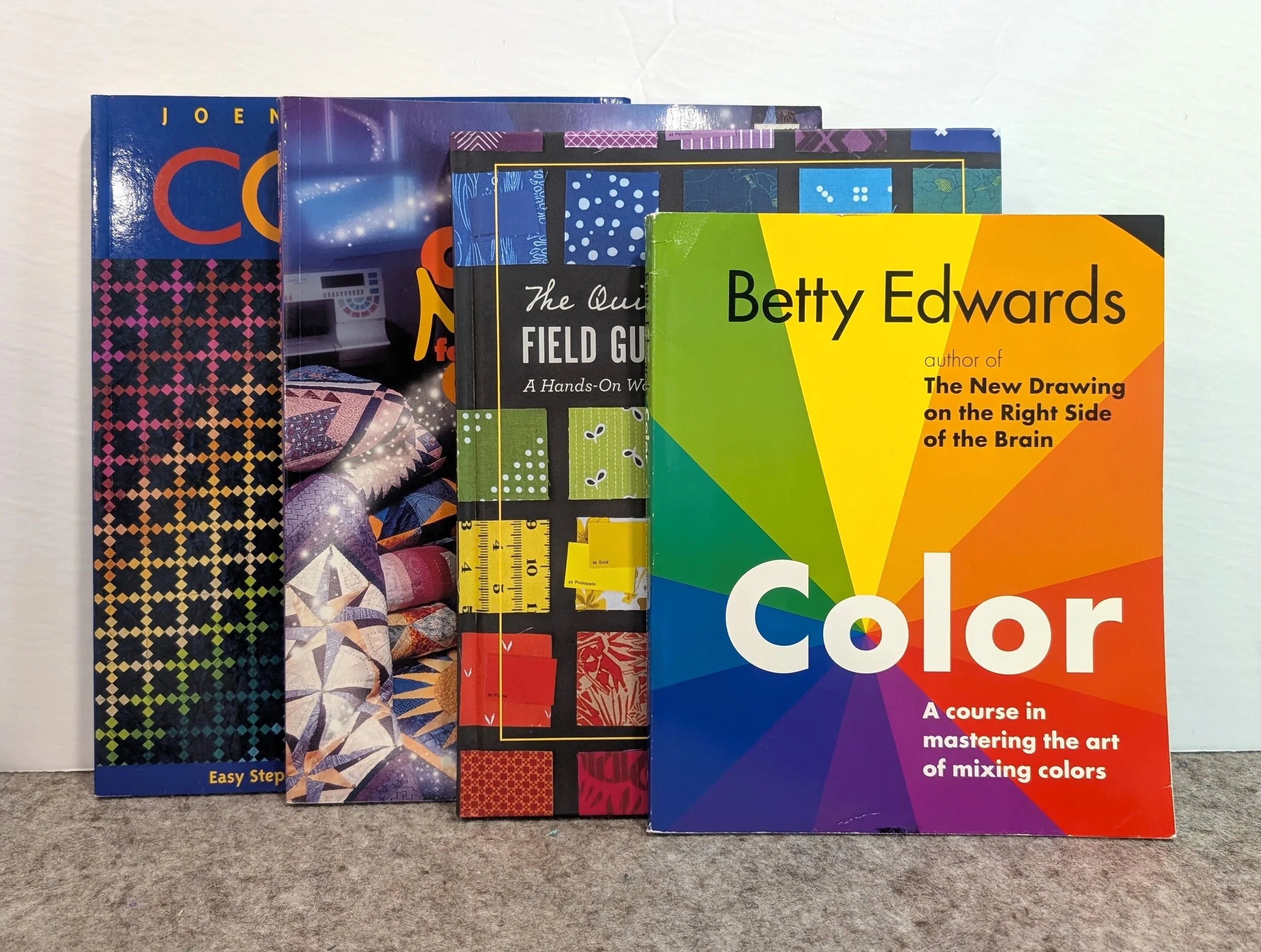
Joen Wolfrom is a well known quilter, designer and author who has some incredible books about color theory and design principles specifically geared to quilters. I own the first edition of her book Color Play, but she has since come out with the second edition that has even more information. The photography alone makes this book so special. Another book, Color Magic for Quilters, is also a feast for the eyes and is full of wonderful information. The two other colour books in my personal library are The Quilter’s Field Guide to Color, and Color by Betty Edwards geared to art, painting and design. I absolutely LOVE that on the cover of the book the first letter ”O” highlights the actual colour wheel in its centre.
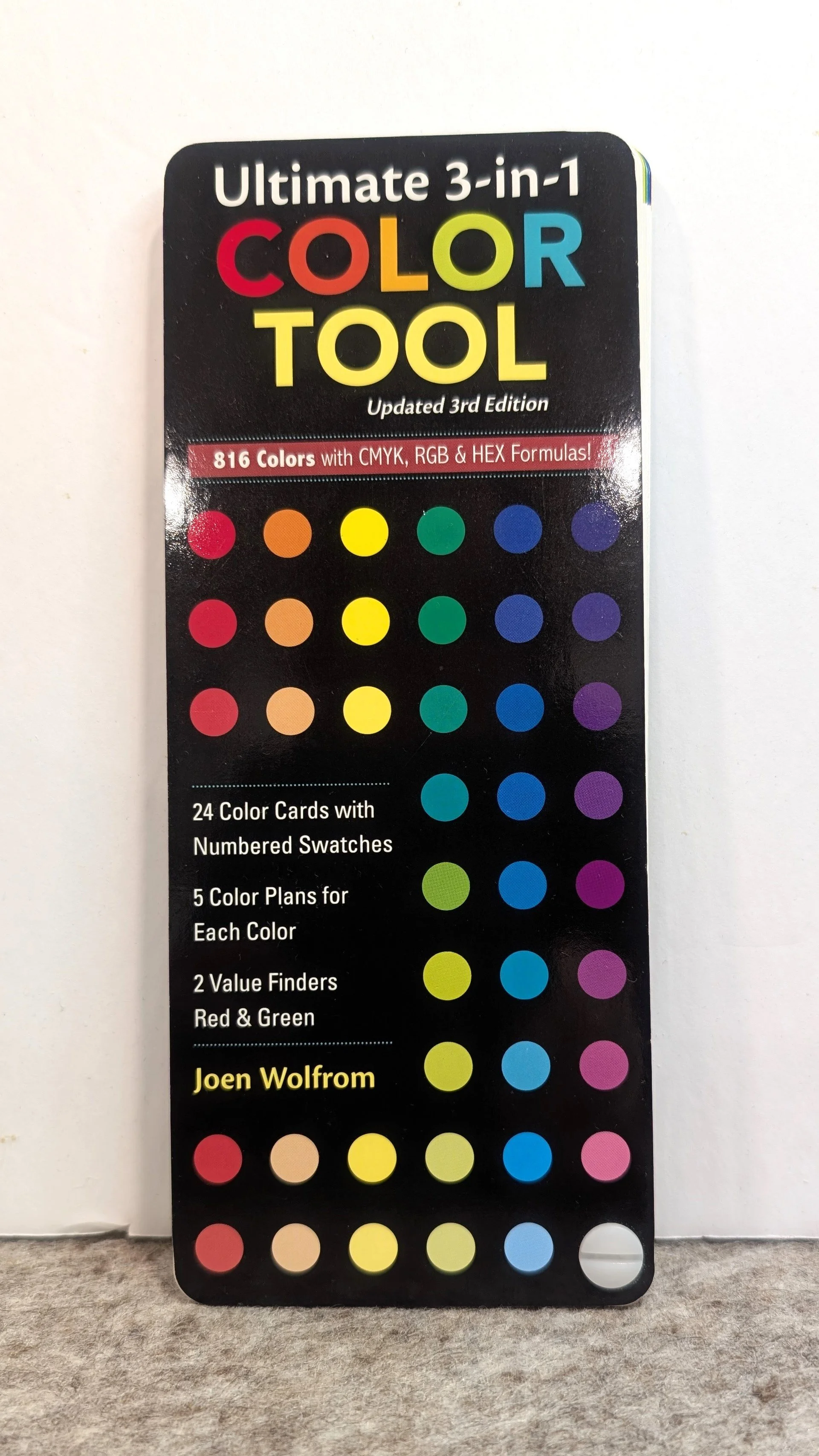
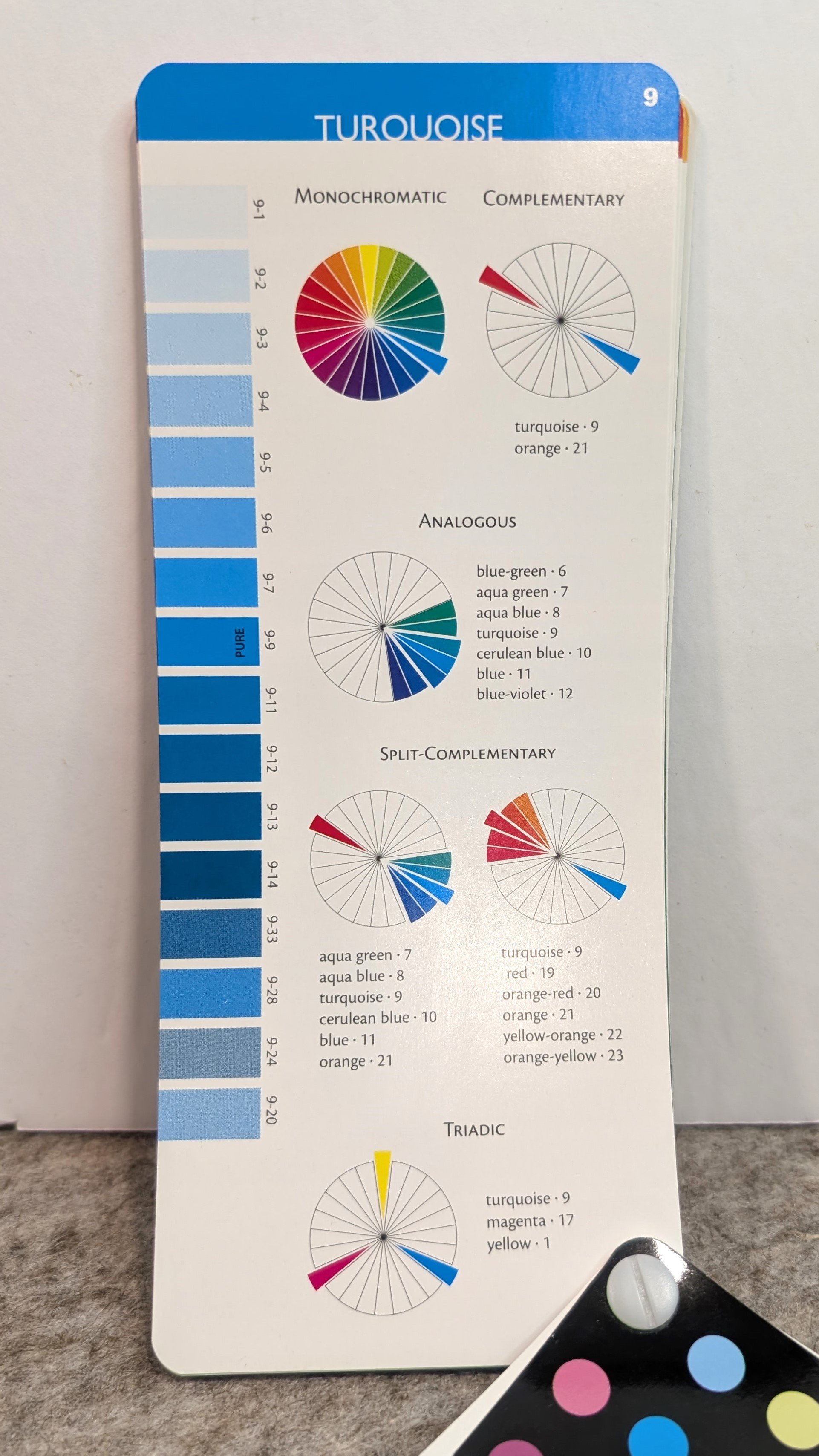
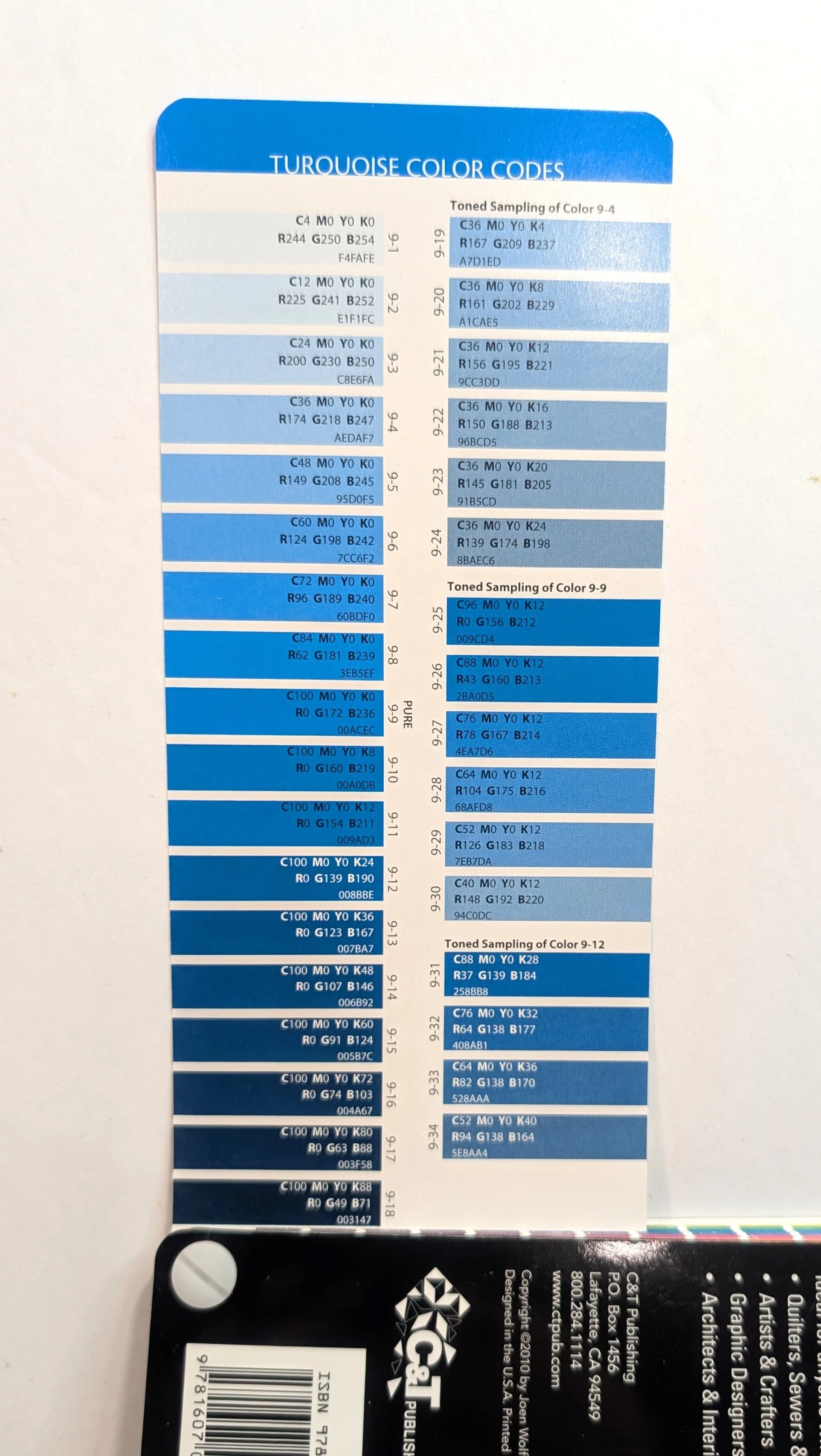
But, by far, my favourite tool for helping with colour theory, is Joen Wolfrom’s Ultimate 3-in-1 Color Tool. It’s small enough that it can fit in your bag when you make a trip to the quilt shop looking for those “just right” colours for your next quilted masterpiece. Each page highlights a specific colour and it even shows which colours to put with it to create the different harmonies. On the back of that same card it shows the tints, tones, and shades of that particular colour so you can get even more variety within the one quilt. My tool is about 15 years old by now and the newer version includes a lot more information, including CMYK and RGB colour formulas as well as hex numbers for those of you who do web and graphic design. You will be excited to get started.
A little bit of knowledge of colour theory is one of those skills that will continue to grow with you on your quilting journey. And it does not need to be intuitive…it can be learned…so don’t be intimidated. Try some of your new-found skills next time you’re at the quilt store.